Here is a list of supplies,
Supplies
- Set of
sketch pencils
- Piece of paper
- Ruler
- Tortillon (optional)
- Kneaded Eraser
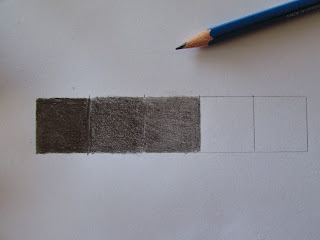
Start by drawing a line of five one-inch squares on your piece of paper using a ruler and 2B pencil.
Taking your 6B pencil, fill in the fist square until it is black. This is the first value on the shading scale.
With your 4B pencil, fill in the second square until it is a dark gray. This is the second value on the shading scale.
With your 2B pencil, fill in the third square creating a medium gray. This is the third value.
With your HB pencil, fill in the fourth square creating a light gray. This, as you might have guessed, is the fourth value. The last square you will leave white, as white is the fifth value on the shading scale.
This next step is optional. With your tortillion shade in the squares (separately) so that the pencil strokes are evened out and the colors appear smoother.
When you are finished, label each of the squares with their appropriate names.
Now you have completed your shade value scale! This scale is
very important and will come in handy for the beginner who is first learning to
shade.
Your probably wondering why in the world this scale is
important. Well, there are five “elements” that go into shading. You will be able
to see a representation of this in my next tutorial about shading basic shapes.
But, first let me explain what each value is used as.
- Black
– this is found where in the cast shadow of an object.
- Dark
Gray – this is the shadow on an object and is always found on
the opposite side of the object where the light is coming from.
3. Medium
Gray – this is called the halftone because it not light, and it’s
not dark either. Basically, it’s the middle ground of shading, locked in
between the light side and the dark side.
4. Light
Gray – this is the hardest of the elements to see when working on an
object. But, it is also the most important one to need to have in your artwork.
It’s called, reflected light. Explanation: reflected light is the light
that bounces up onto the object from whatever it’s on, and all of the light
behind it. Reflected light separates shadows from cast shadows.
5. White
– this is the full light area. This is where light lands the
strongest on an object, and so, the white of the paper is left fully exposed.
Each value is important to making your drawings look real. I
can’t stress that enough. Without these five basic values, your artwork would
look flat and unrealistic. So, now that you know that, it’s time for me to get
to work completing my shading basic shapes tutorial!
.jpg)


No comments:
Post a Comment